Services

You have a vision
We have a way to explore the ideas!
We have a way to explore the ideas!


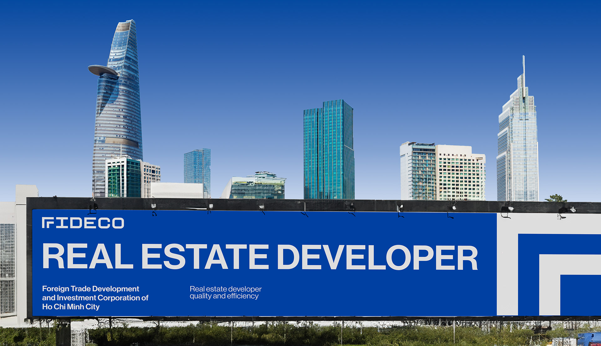
REAL ESTATE
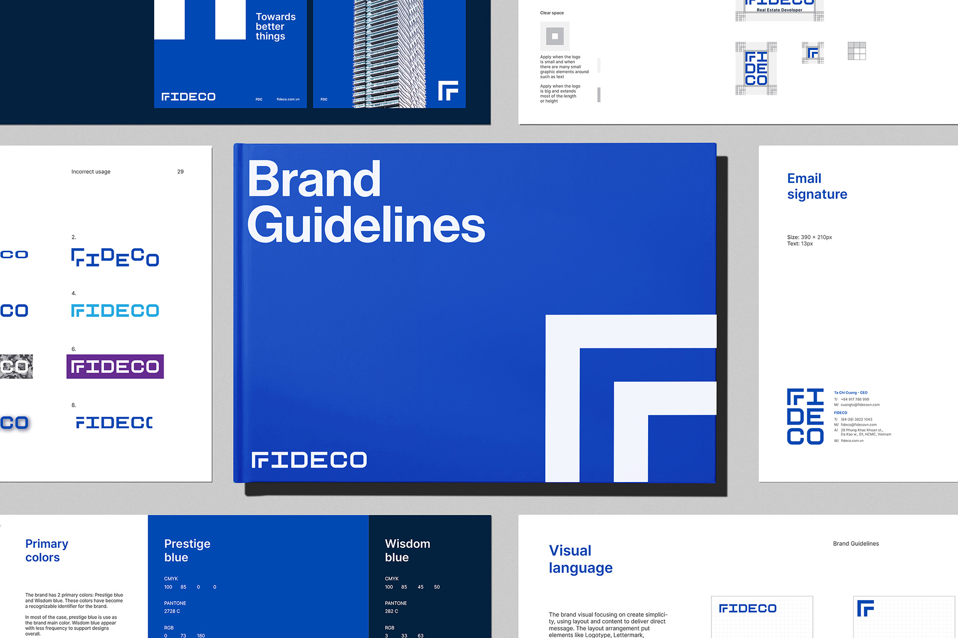
Rebrand
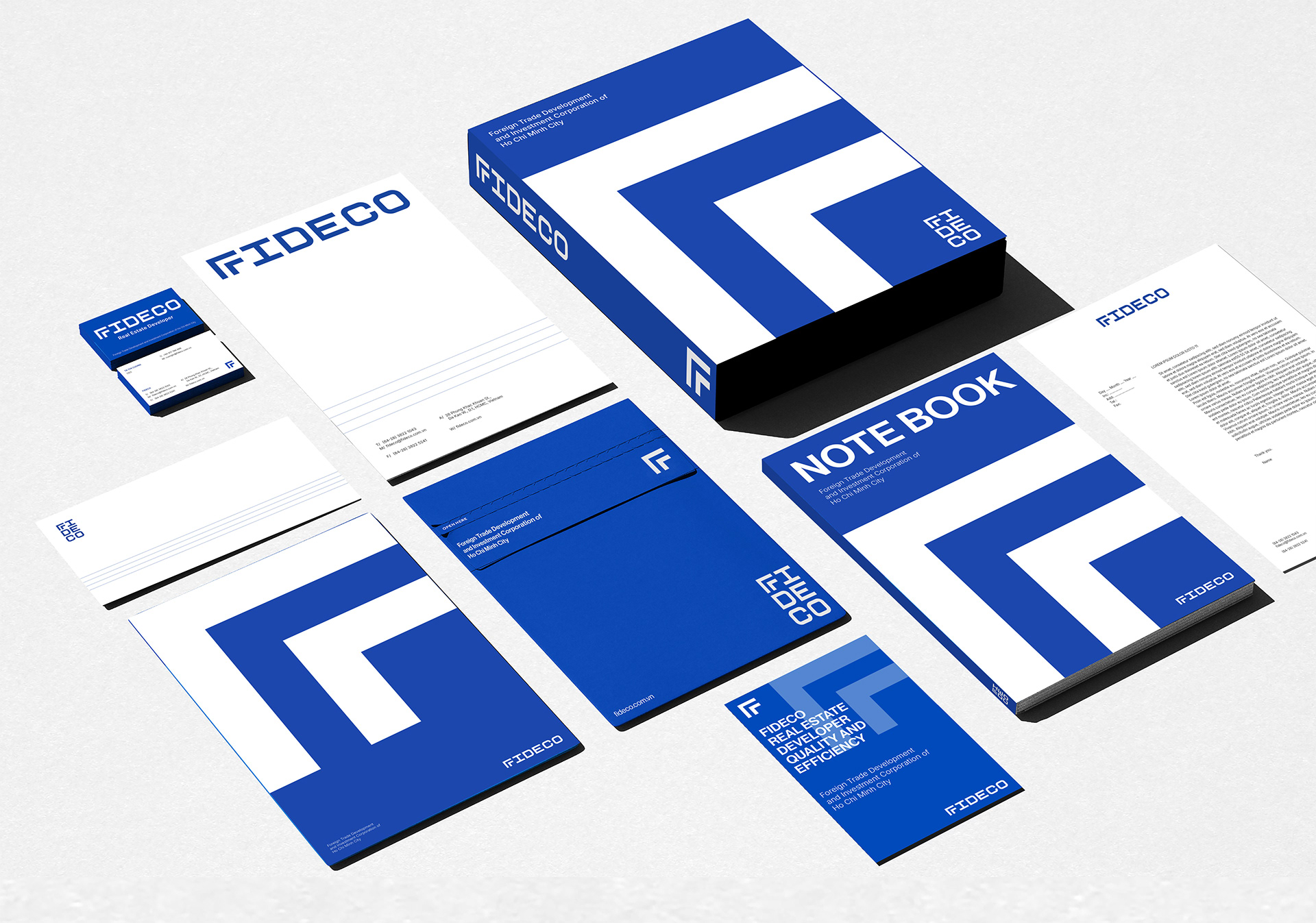
Brand Identity
Website Design
Website Development
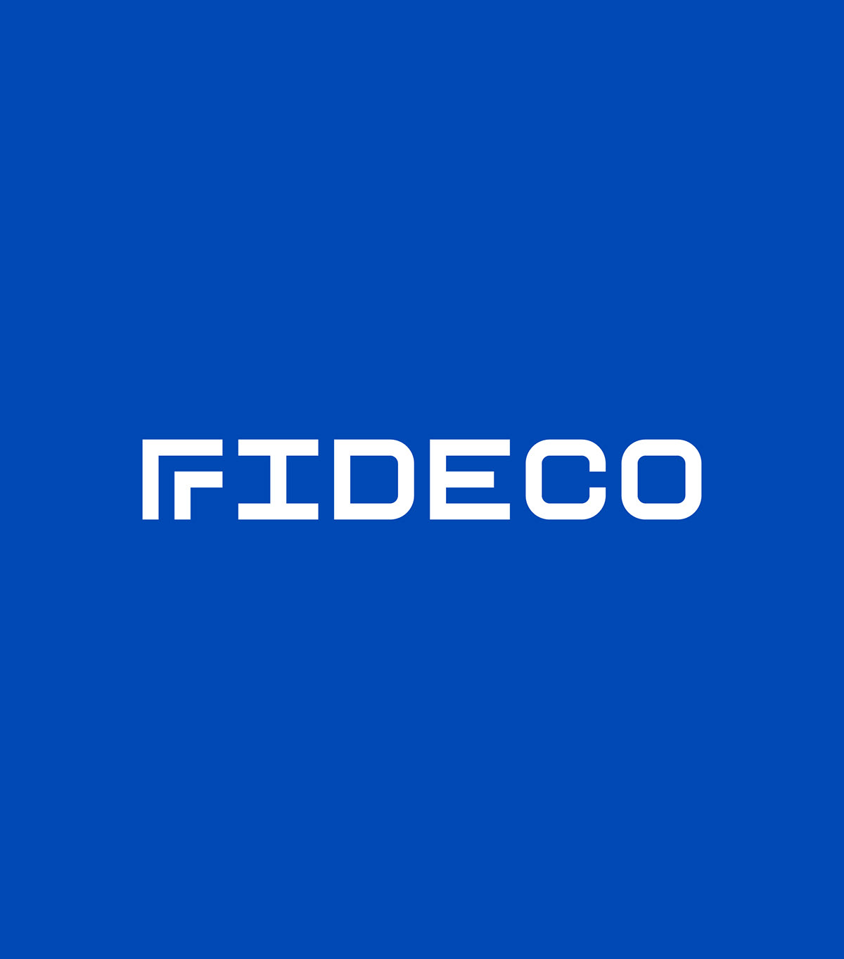
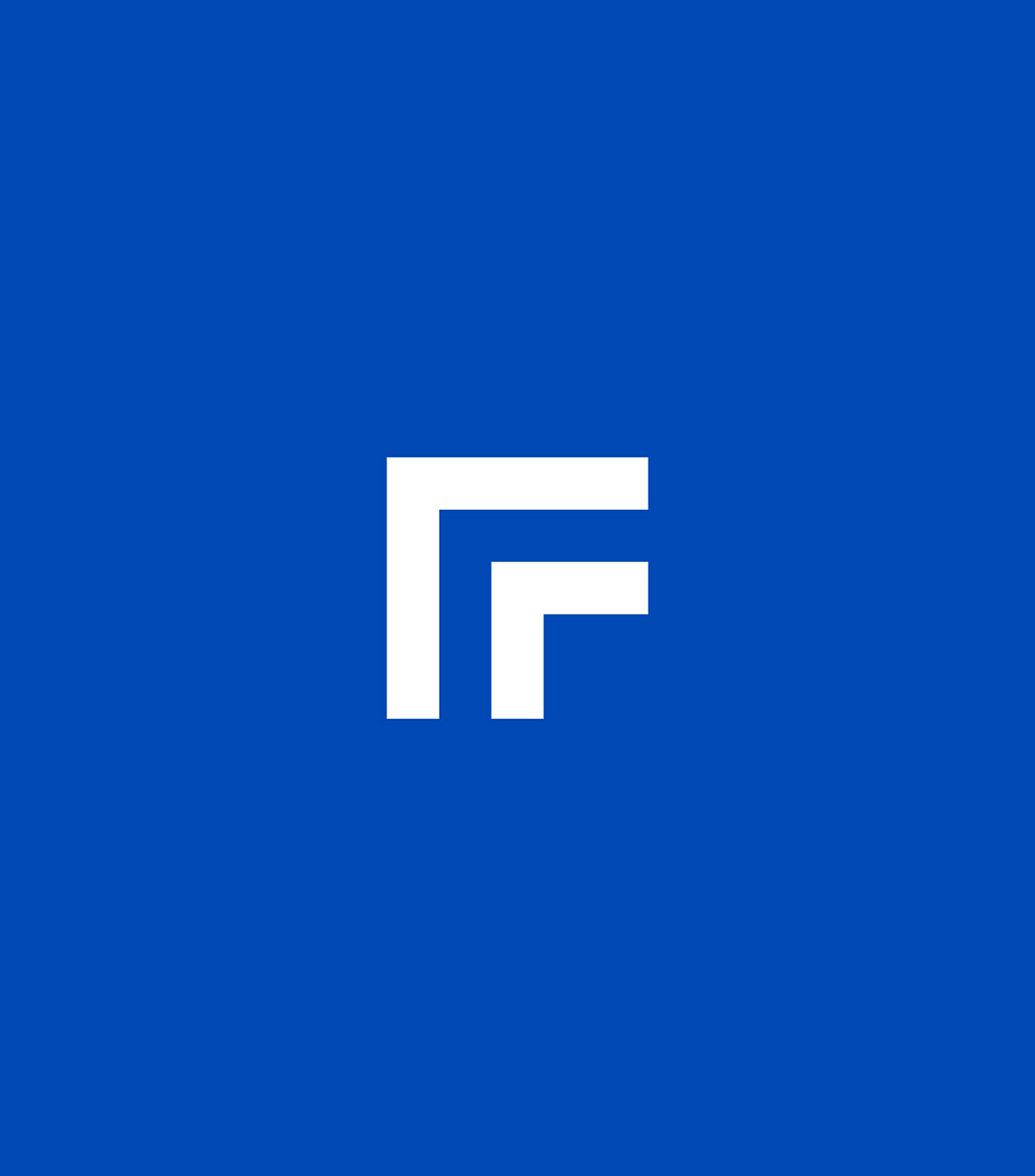
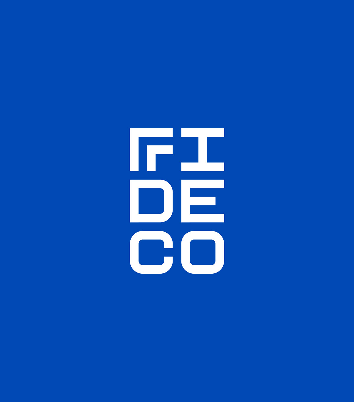
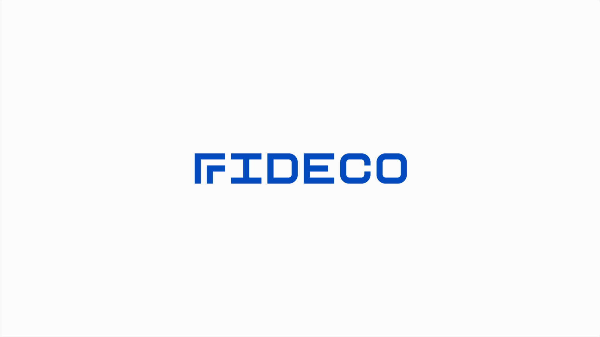
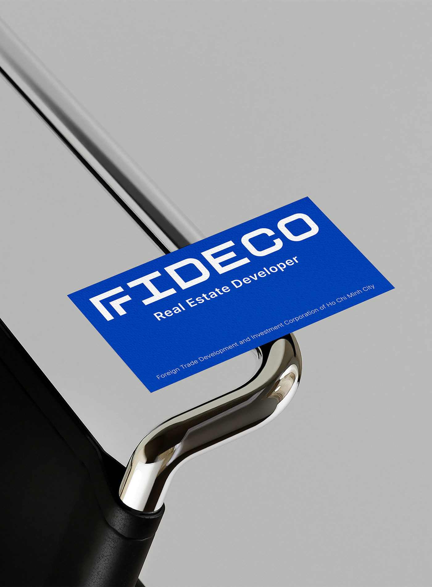
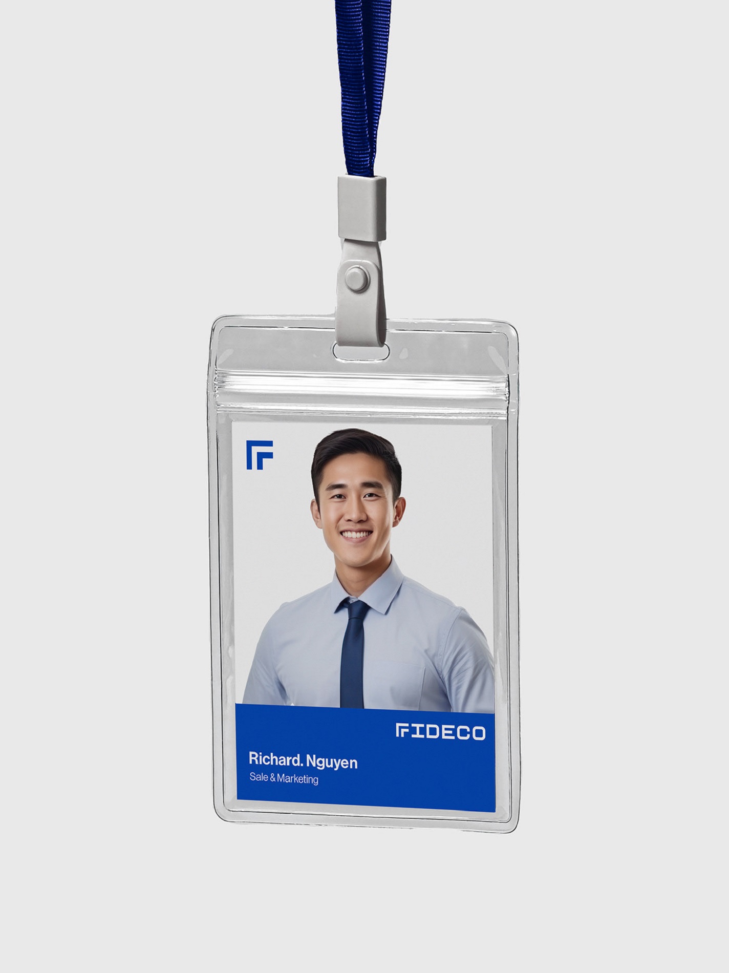
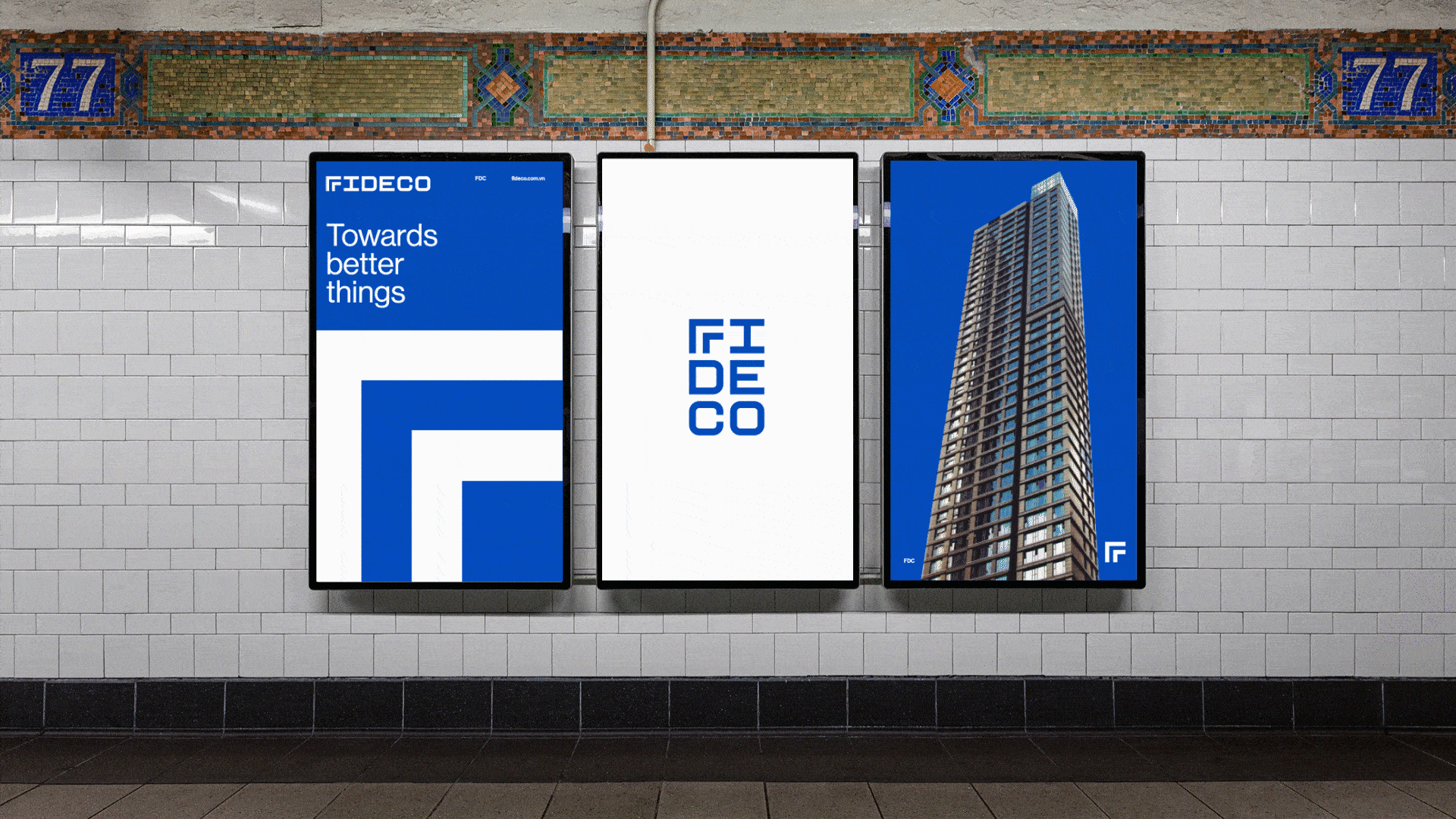
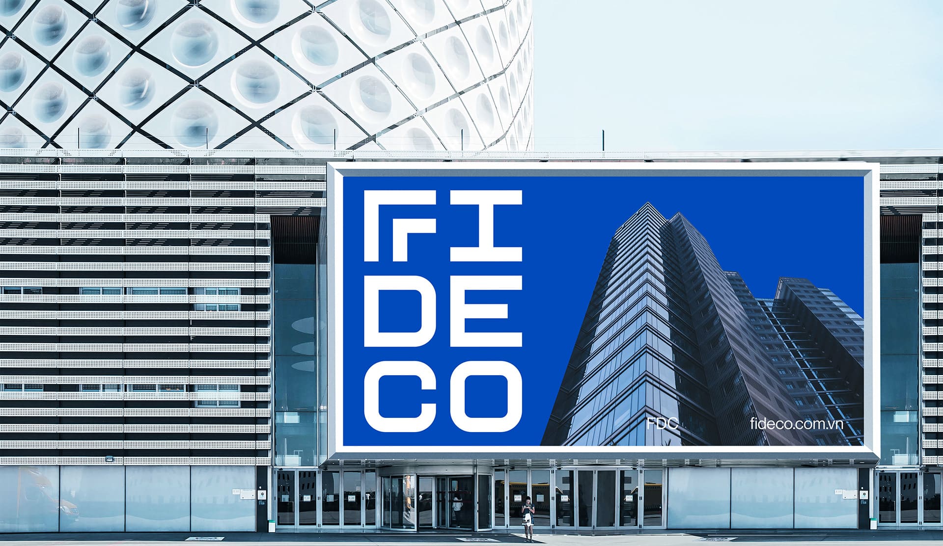
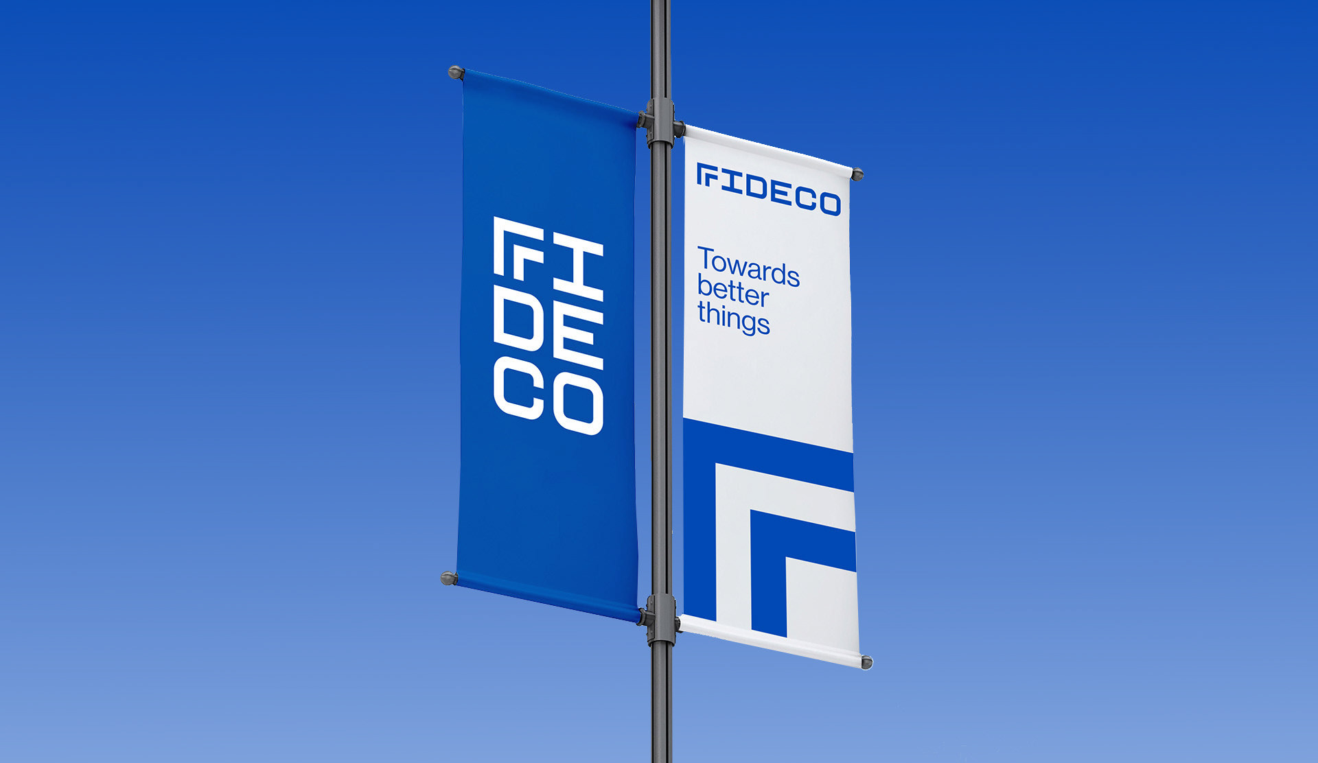
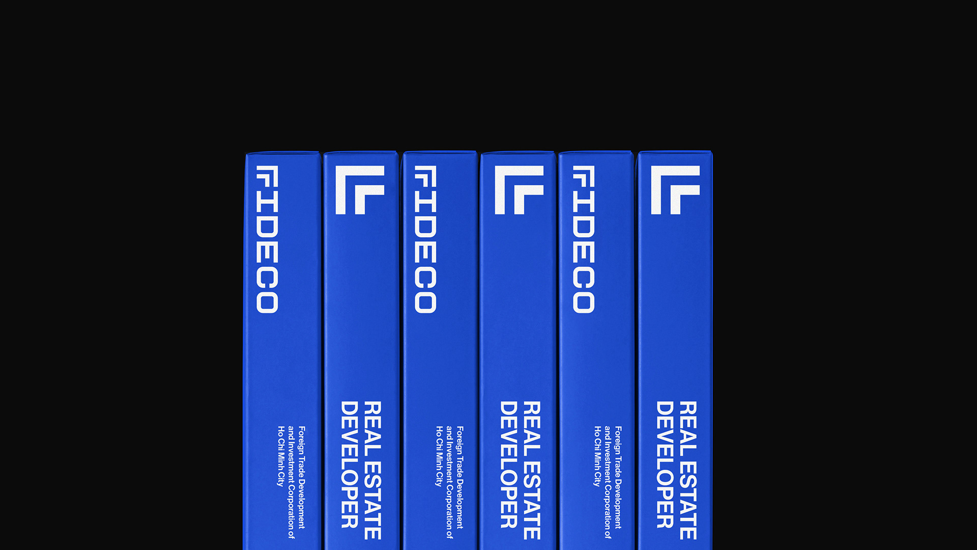
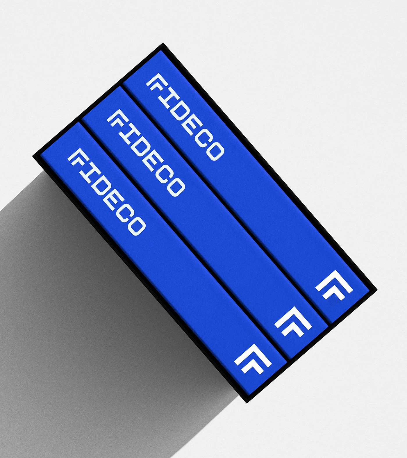
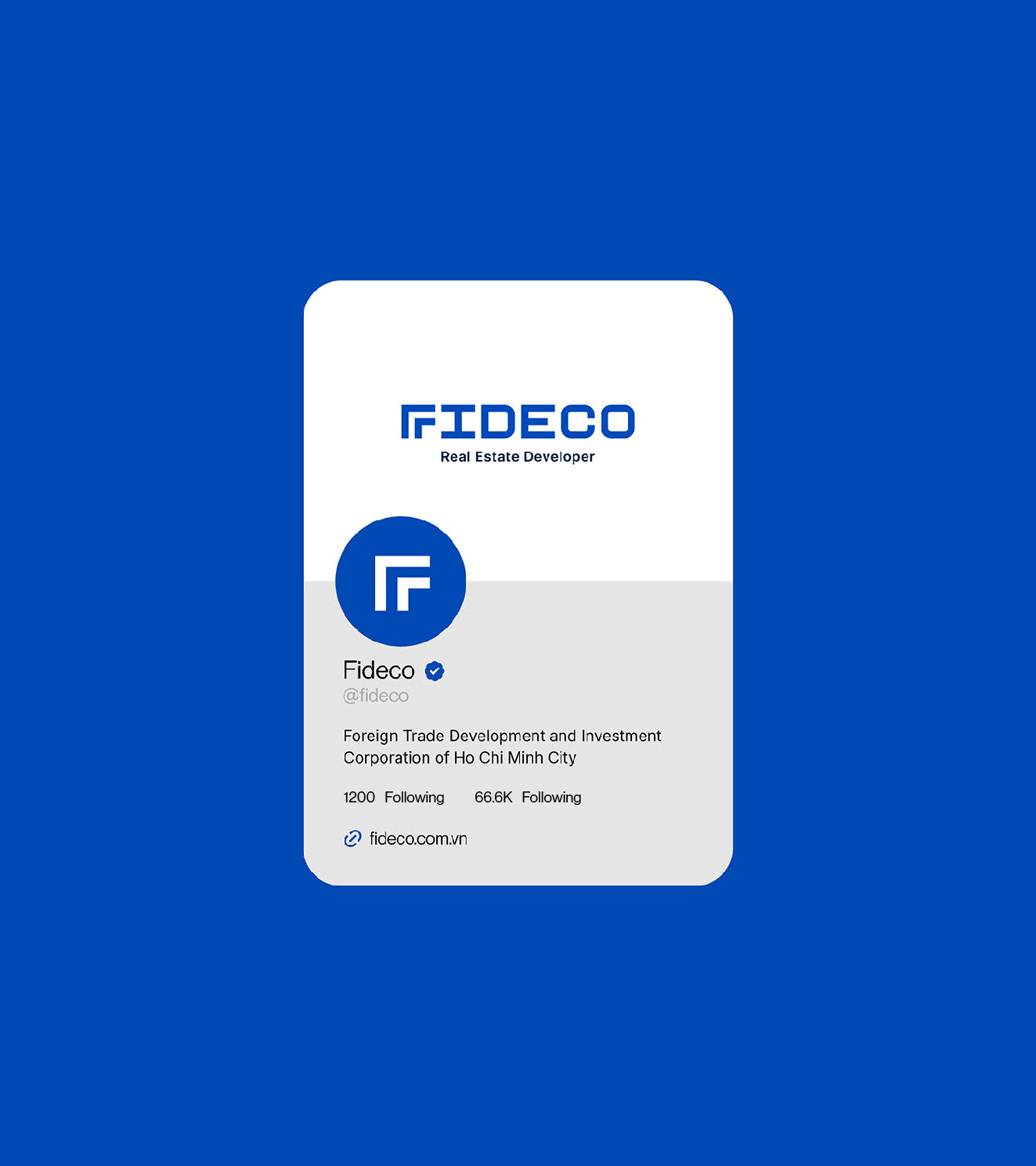
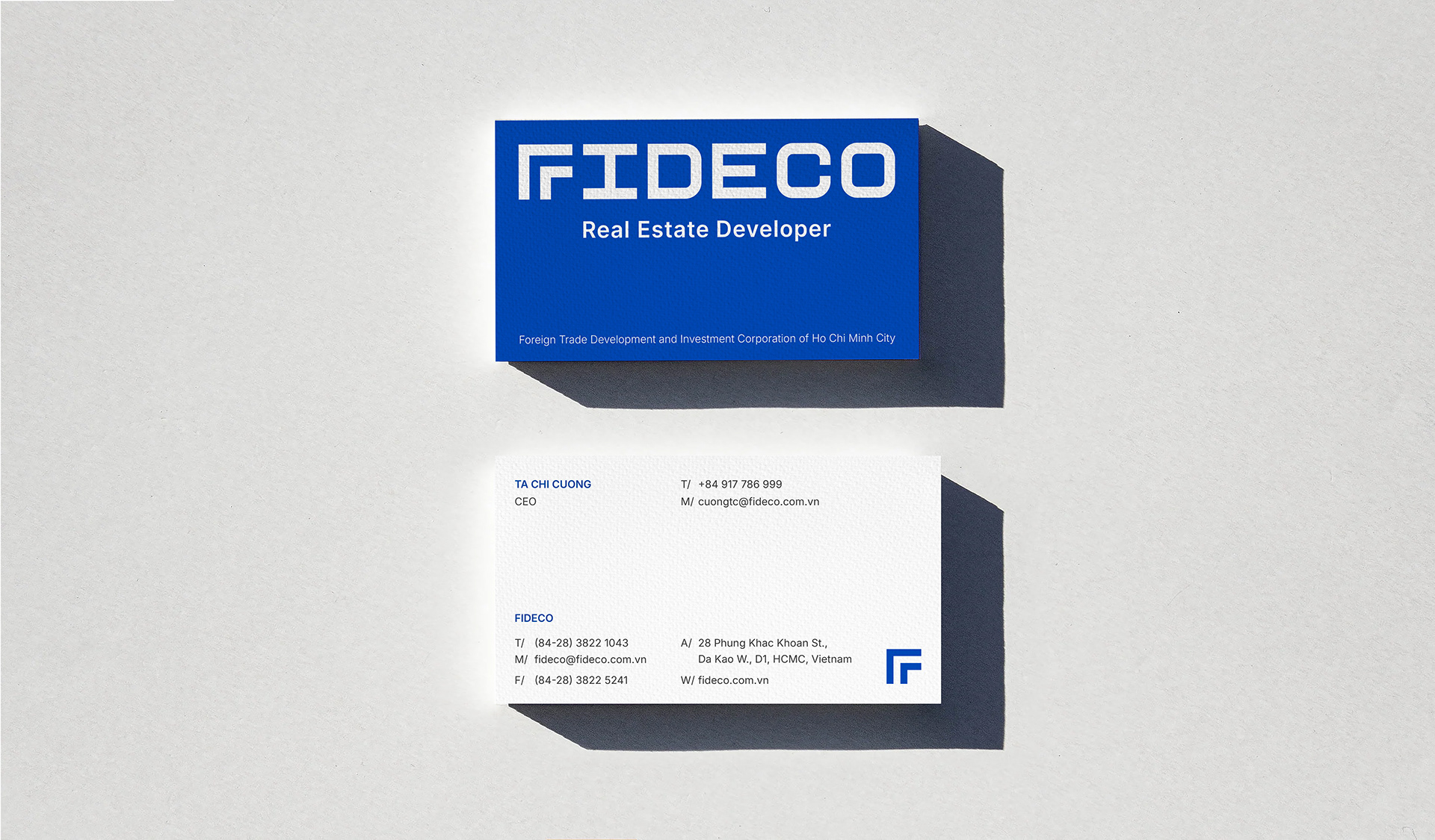
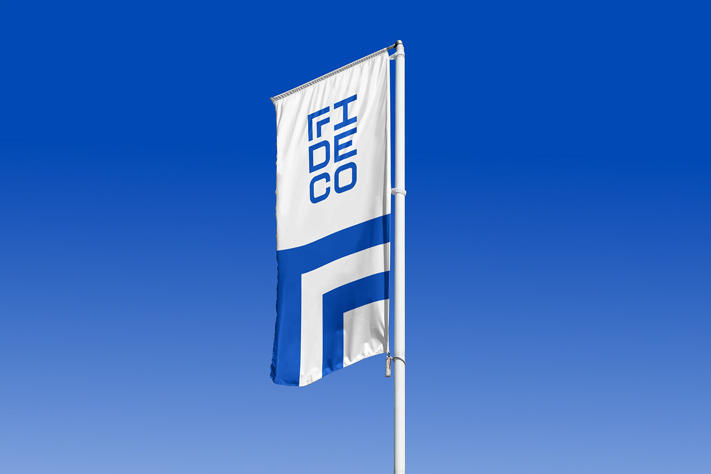
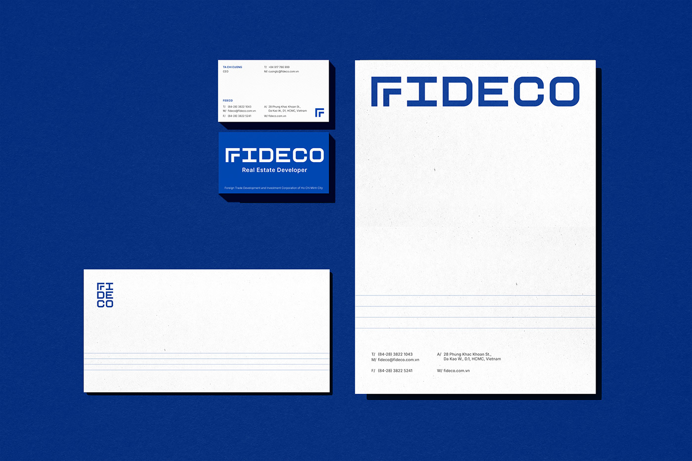
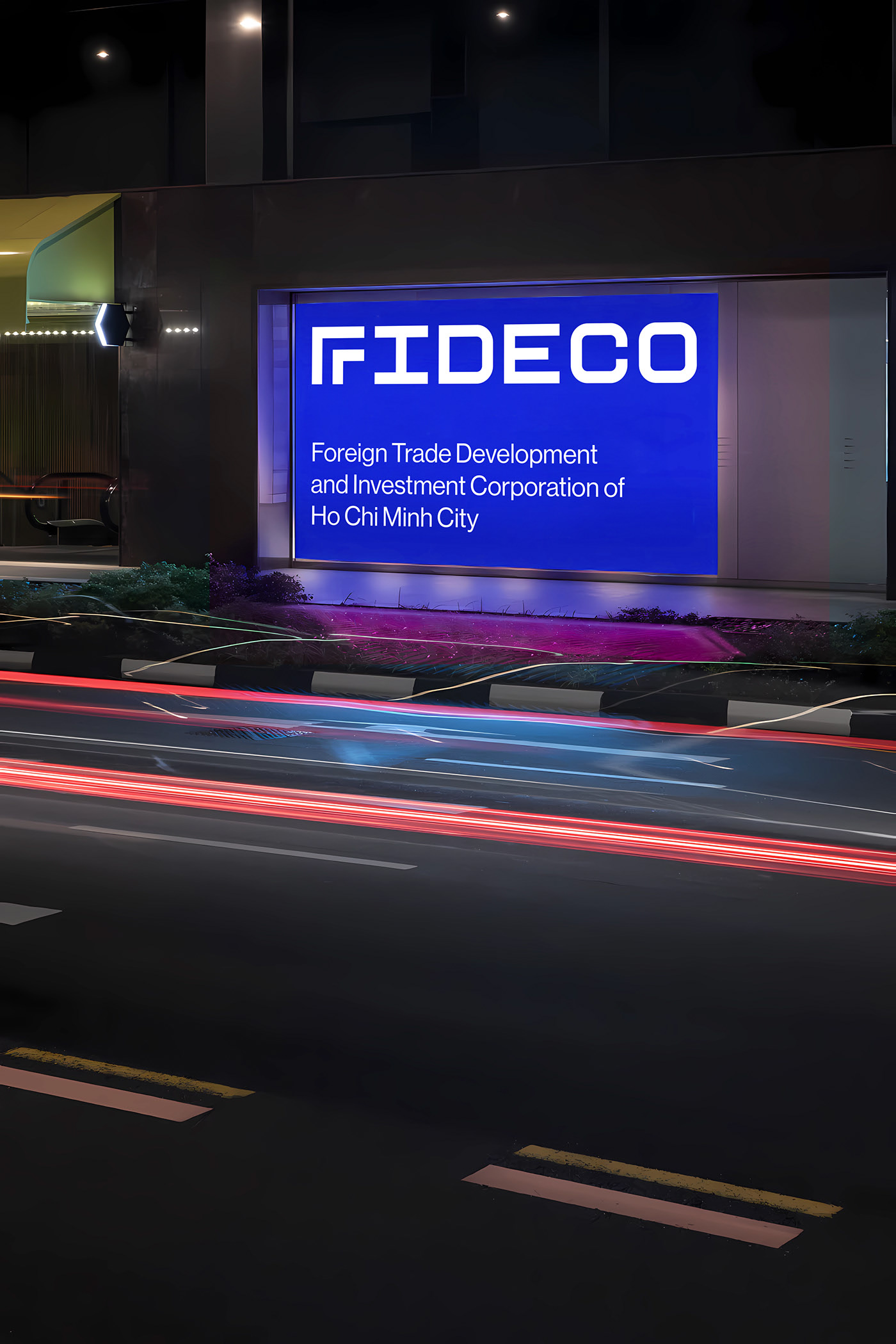
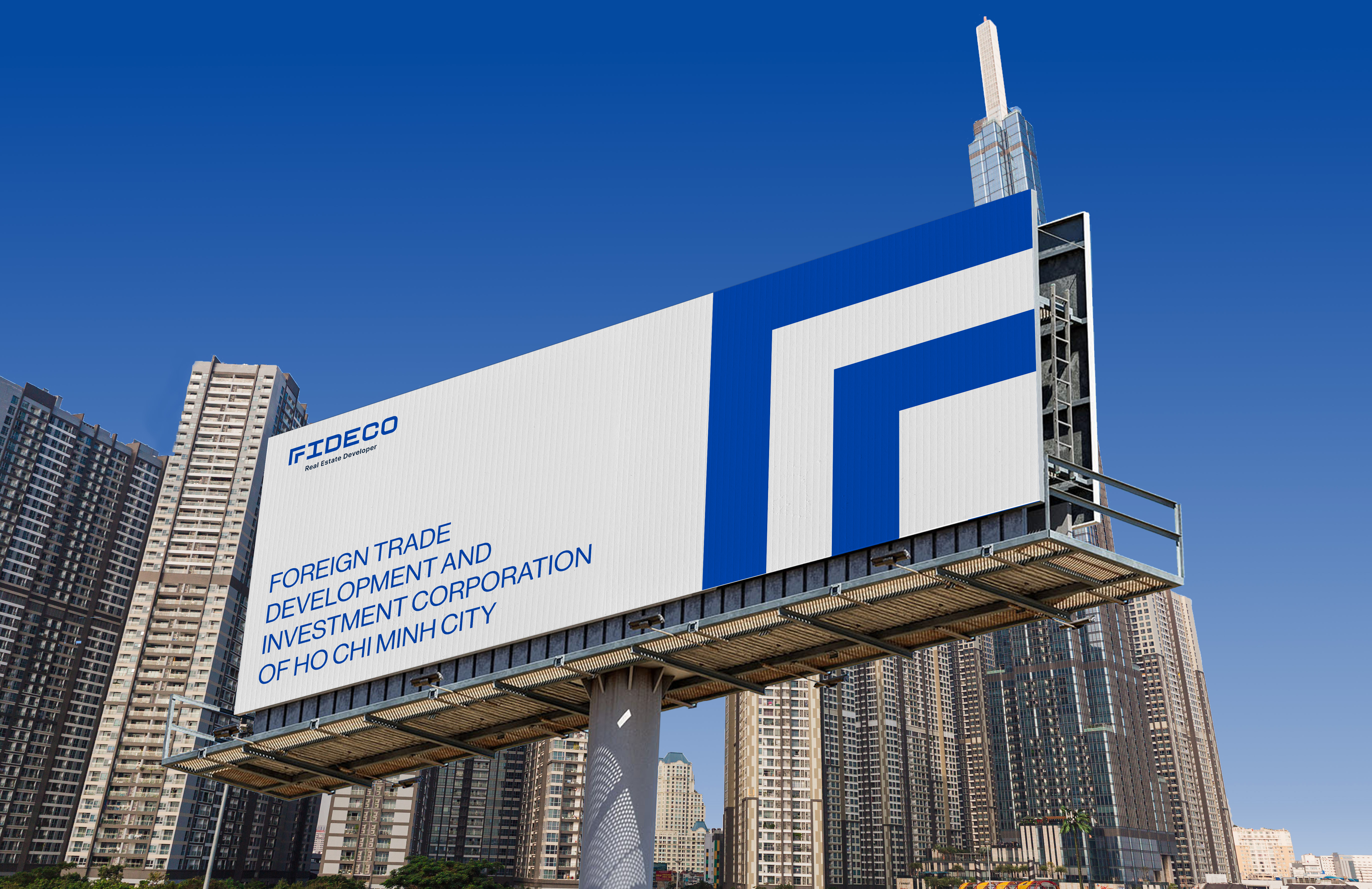
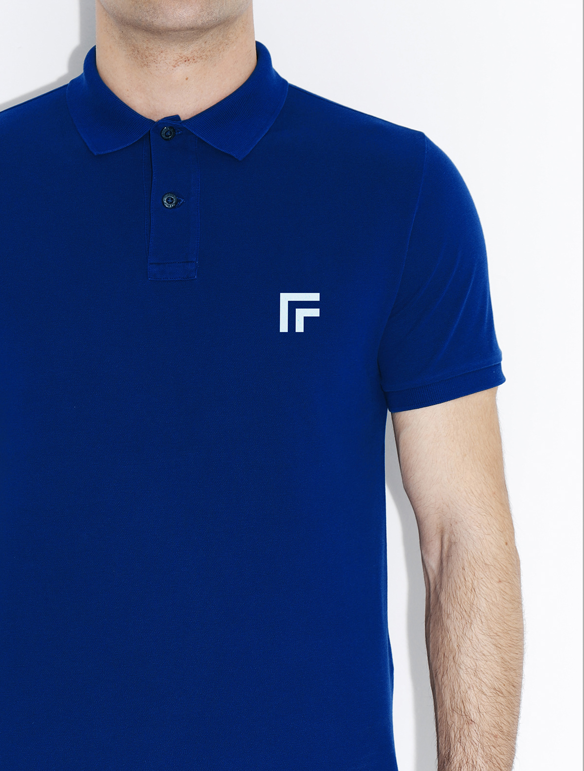
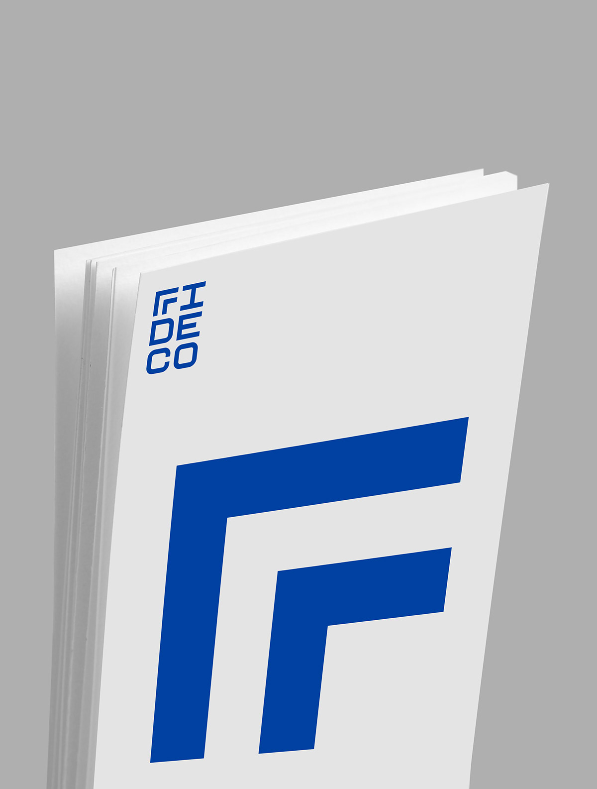
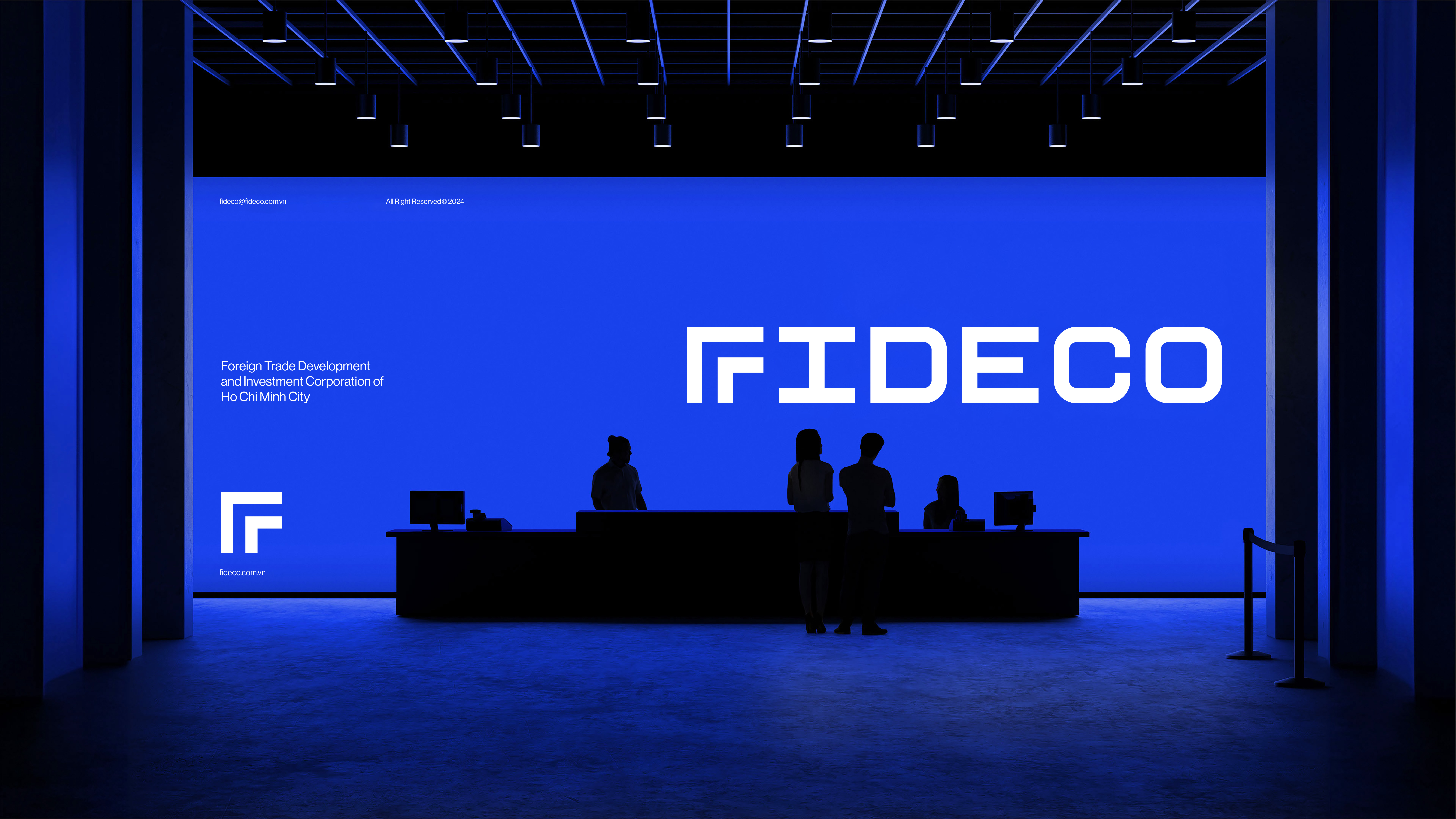
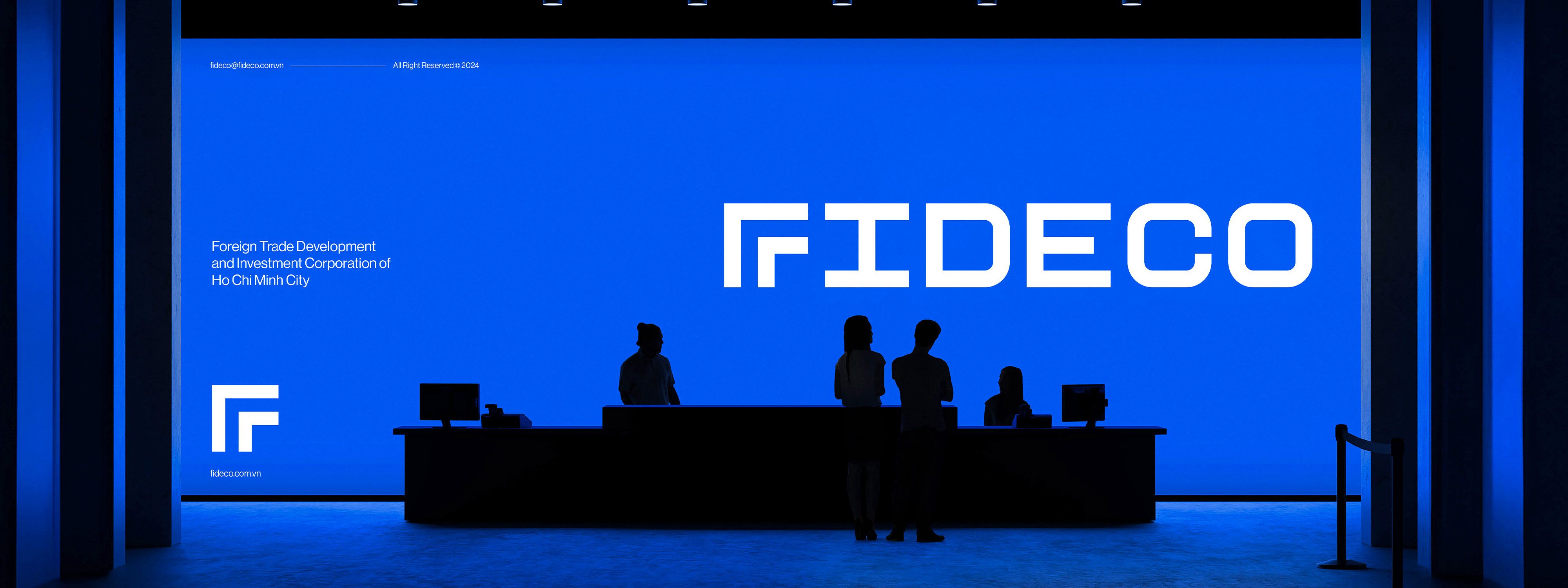
The main highlight of the logo is the letter “F” stylized into two upward arrows. This image represents Fideco’s robust growth, ambition, and continuous progress. The two arrows within the brand name clearly express the company’s belief and aspiration to achieve future goals. The predominant use of blue symbolizes trust, safety, and professionalism, while also reaffirming Fideco’s primary focus in the real estate sector.