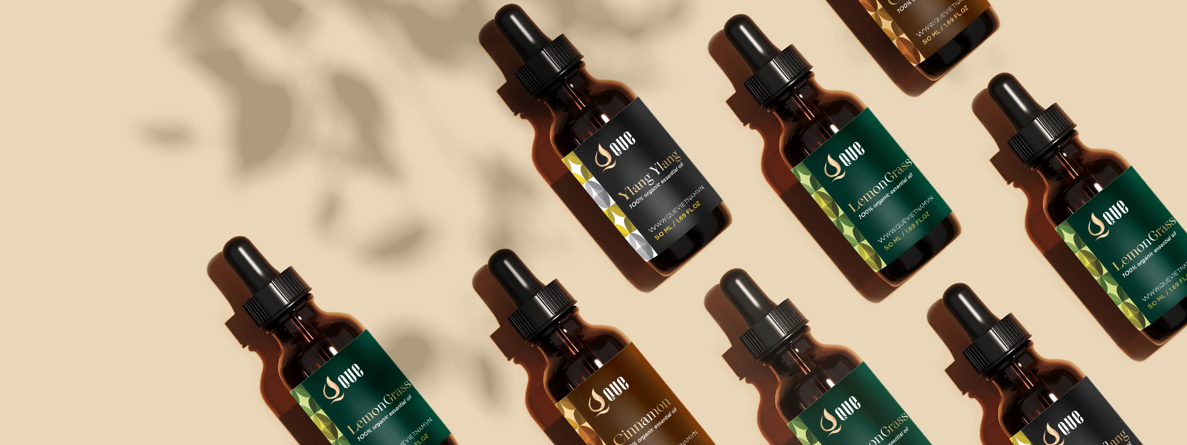

ESSENTIAL OIL
Packaging
Brand Identity
QUE means “Quế” – a familiar name to most Vietnamese families, inspired by 100% natural extracts of the aroma and warmth of “Quế” which is the source of inspiration for QUE’s logo and packaging.
If you look closely at the logo, the overall image is a burning flame, embracing a droplet of water inside, symbolizing the contrast of yin-yang, softness-hardness, and warmth-coolness of QUE’s essential oils. The stylized drawing below creates harmony in the Q-QUE logo.
The packaging designs meet a modern, gentle, and luxurious style, attracting users with different color schemes corresponding to different fragrances.